Design Systems / Mobile/ E-commerce
One token architecture, scaled across two brands — built for a global FMCG brand's mobile e-commerce and parenting platform.
(01)
Overview
The client is a global FMCG company with a multi-brand product ecosystem. Two brands needed to share one design system while maintaining their own visual identities.
My role was to make the system more scalable: improving token architecture, component structure, documentation, and design-to-dev alignment.
(02)
Problems
(01)
Token names described appearance, not role
Token names mixed color, state, and context, so designers had to guess how to use them instead of relying on the system.
(02)
Brand values mixed into semantic names
Some tokens included brand-specific colors, which worked for one brand but made reuse across another brand difficult.
(03)
No clear layered hierarchy
Semantic tokens were mixed with raw values and inconsistent roles, making the system harder to scale or update safely.
(04)
The design-to-code gap
Once the system began moving toward Tailwind, token names and component states needed to be translated clearly into code.
(03)
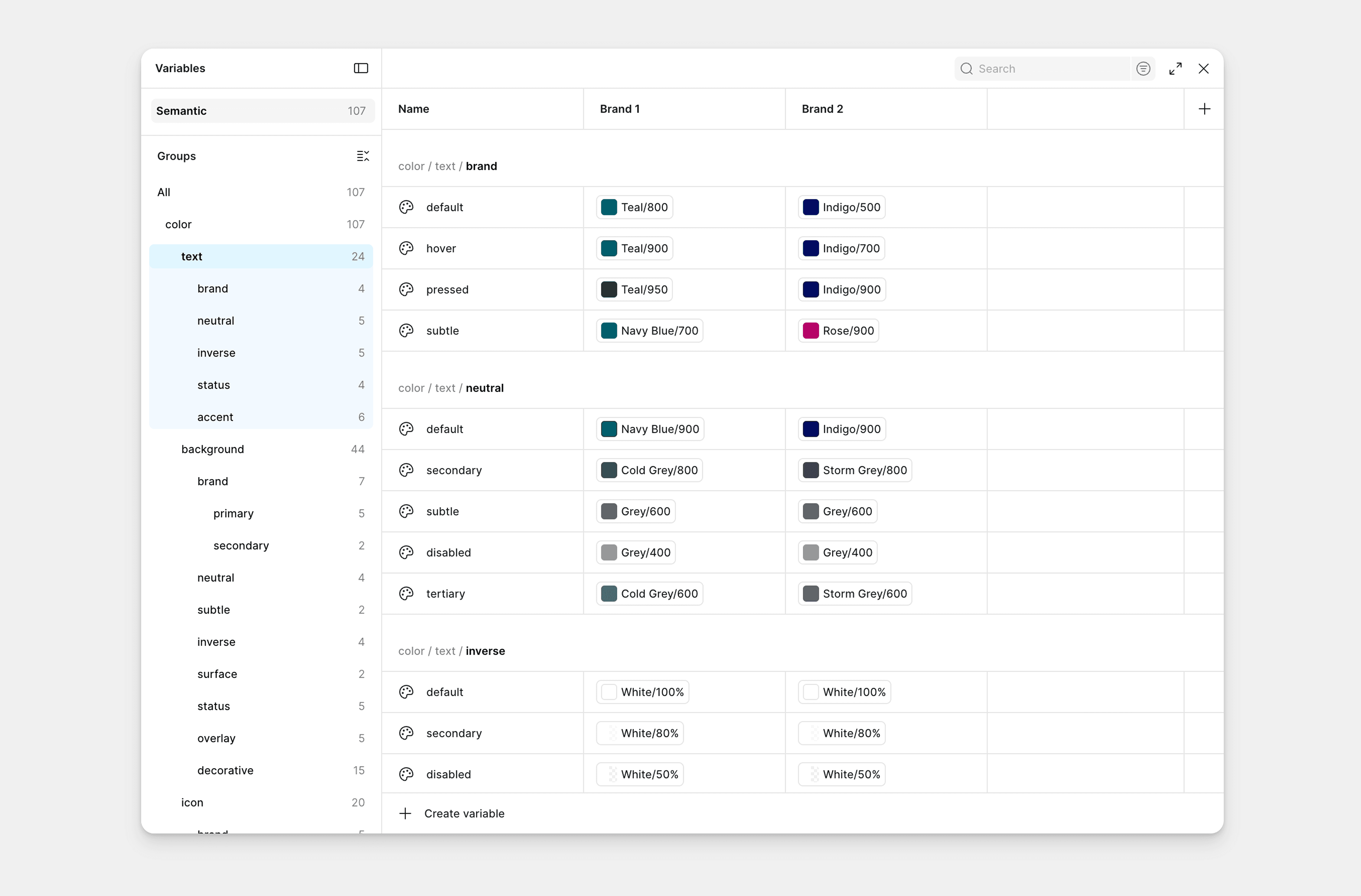
Design Tokens
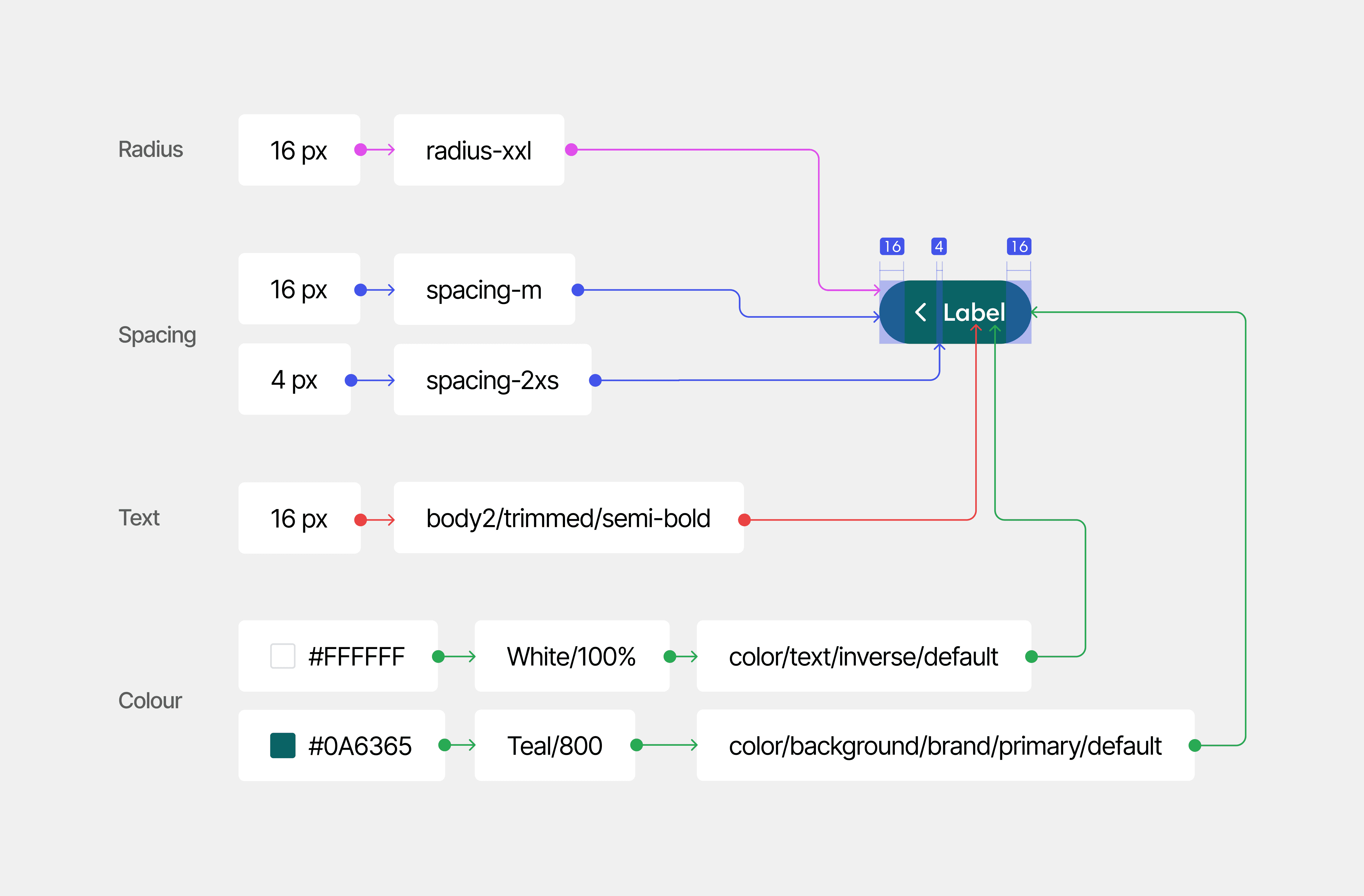
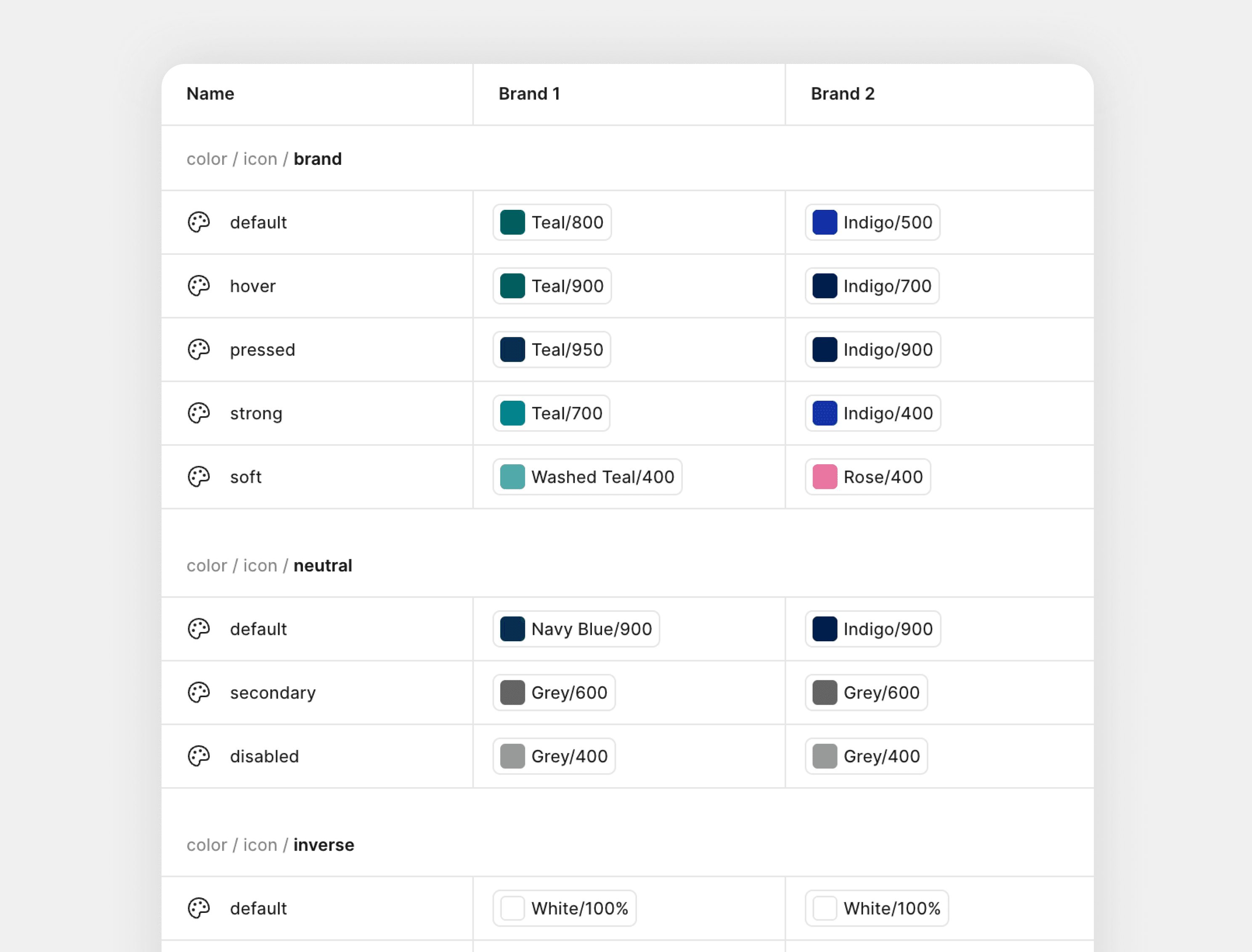
I restructured colour tokens to describe their role, not their appearance.
Brand colours were mapped into semantic tokens like background, text, icon, border, and state. This made the system more self-explanatory, easier to reuse across two brands, and clearer for developers to implement.
(04)
Typography
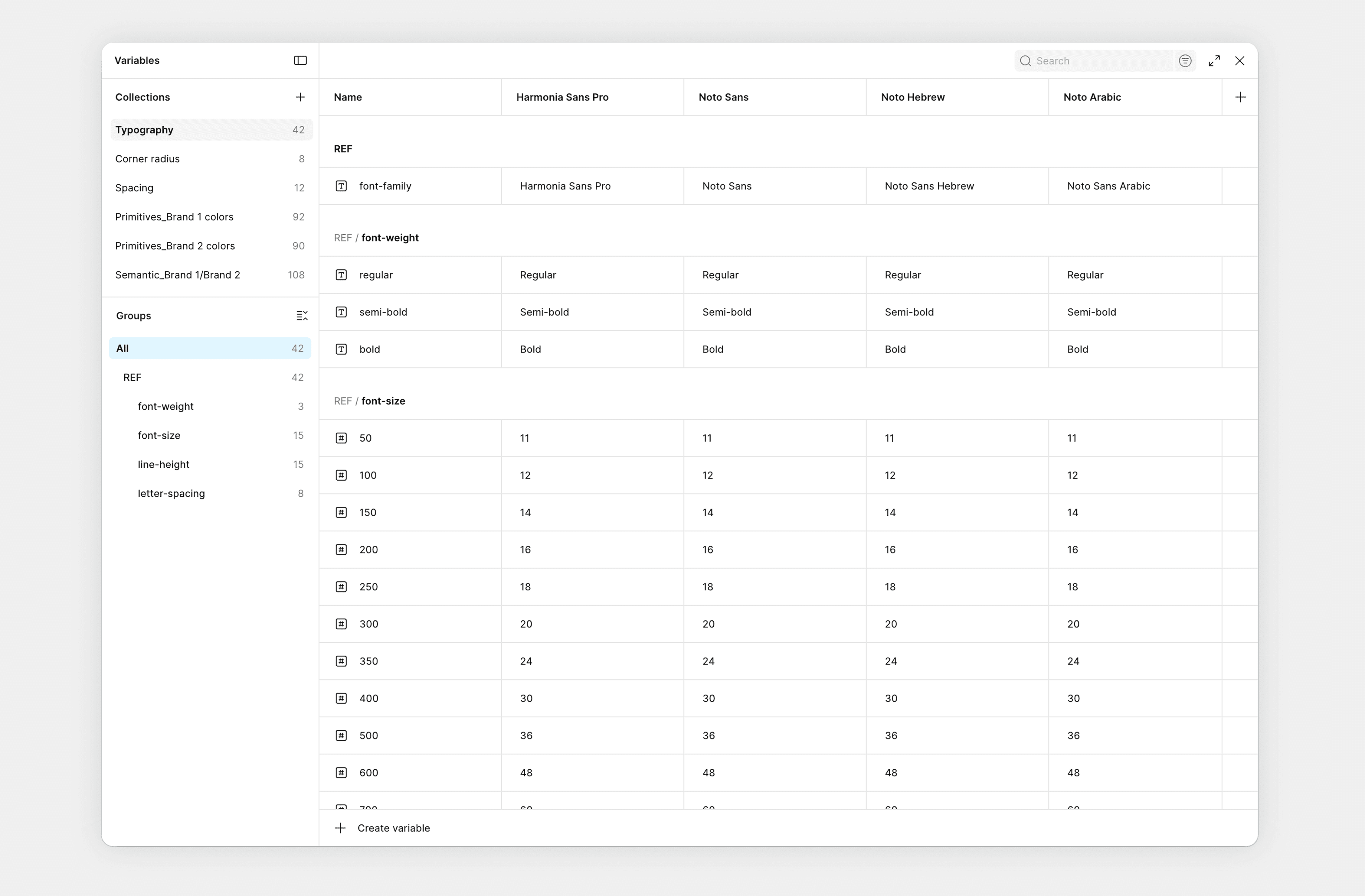
The product runs across several markets, and Harmonia Sans Pro doesn't support all the scripts they need. So checking a design in a non-Latin market meant swapping fonts by hand every time.
I moved the font setup into variable modes — Harmonia Sans Pro, Noto Sans: Hebrew, Arabic, and Korean, all sitting behind one font-family variable. One click and a designer sees their screen in the right script.
(05)
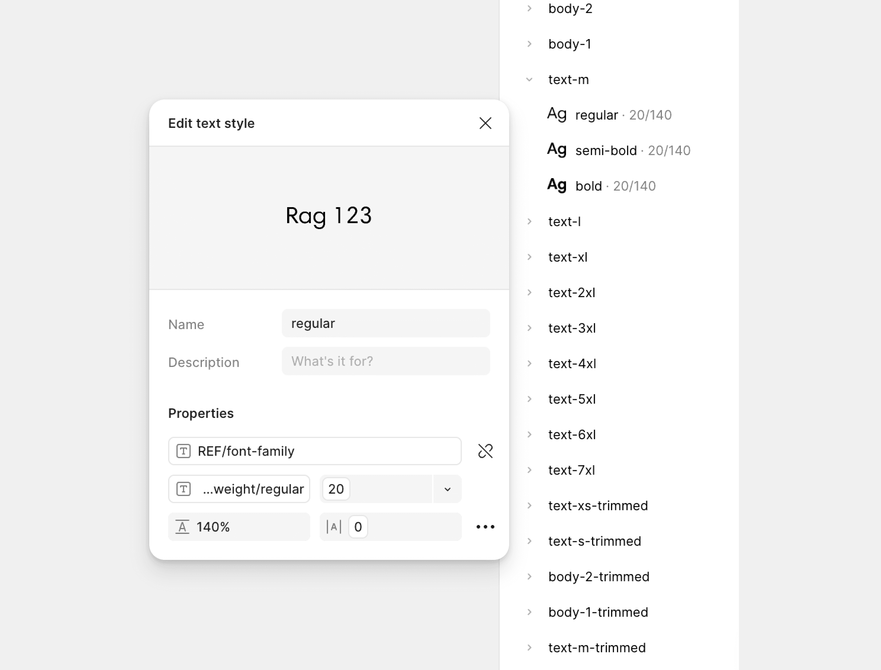
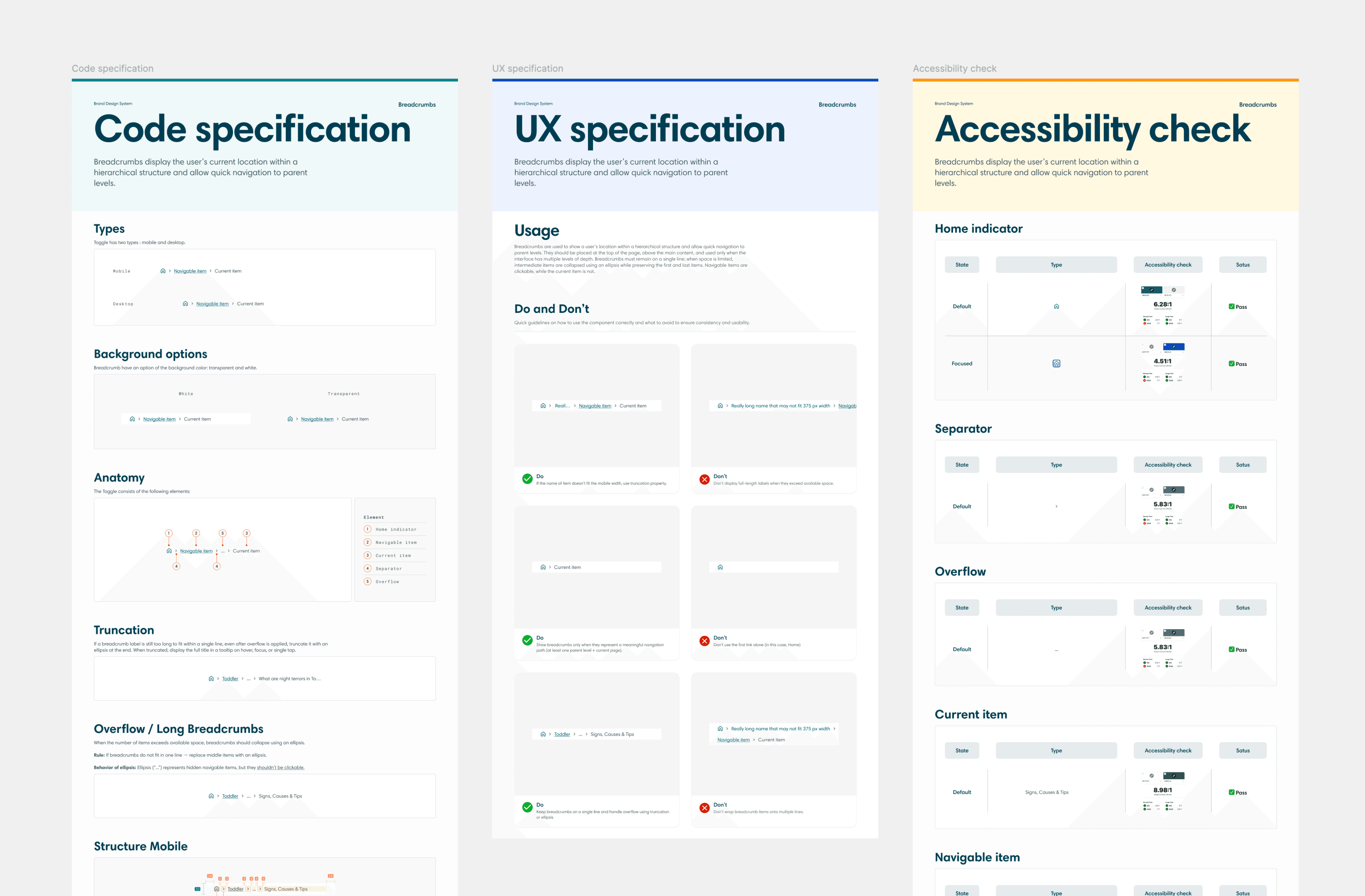
Design system documentation
I created component documentation that covers UX rules, code specifications, and accessibility checks to support faster onboarding, consistent use of the design system, and smoother developer handoff.
Accessibility was a primary client requirement, so the documentation includes guidance on states, contrast, focus behavior, and proper component usage. The code specs also assist developers in speeding up implementation with Claude MCP.
(06)
Results
Consistency - two brands now run on one shared system, with inconsistencies caught at the token level.
Efficiency - developers reuse system components instead of rebuilding from scratch, reducing handoff questions.
Scalability - The same architecture supports two brands and inverse mode without restructuring.
Collaboration - Code specs connect with Claude MCP, making implementation faster and less dependent on manual interpretation.

(08)
Takeaways
(01)
Structure matters more than adding components
The key was improving the semantic token layer so the system could scale safely across brands.
(02)
Naming is architecture
Token names had to support two brands, inverse mode, and Tailwind — not just describe current colors.
(03)
Documentation drives adoption
UX, code, accessibility specs helped teams apply the system consistently and reduce handoff ambiguity.
(04)
Design-to-code alignment starts early
The system became stronger when Figma structure and implementation logic were considered together.

